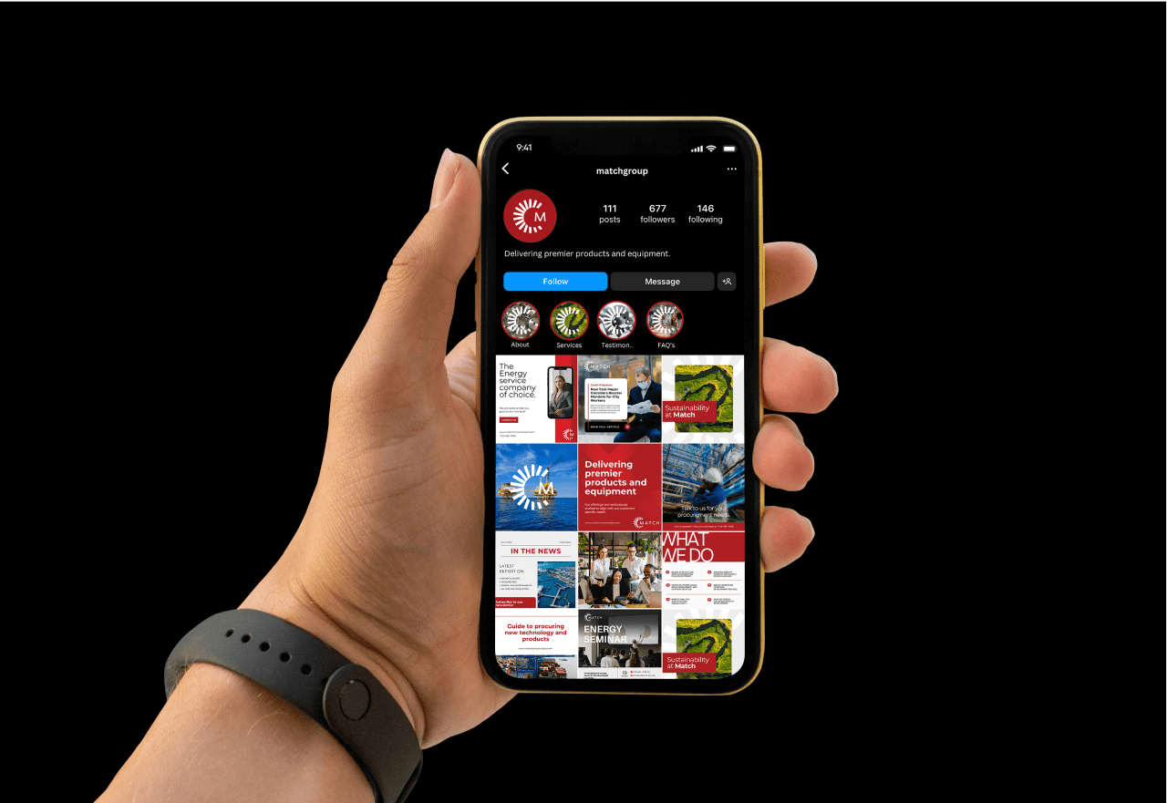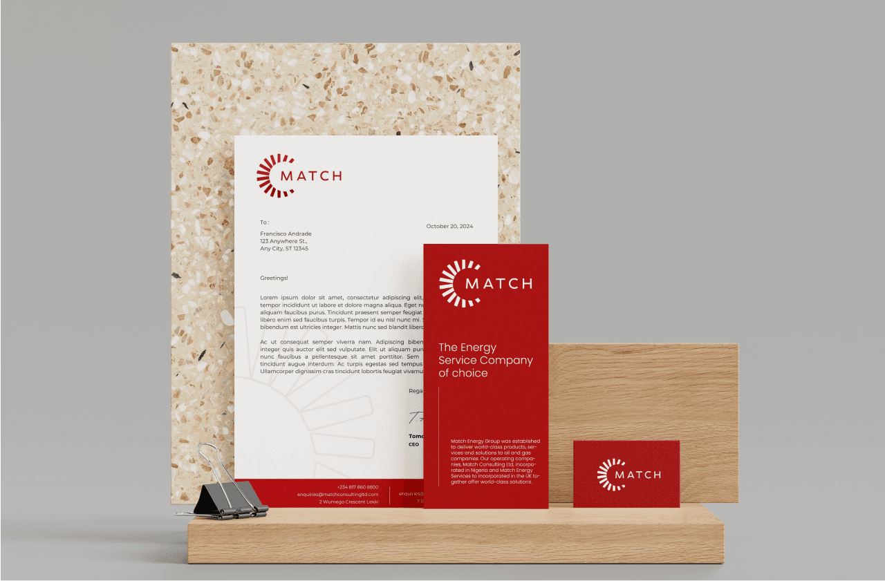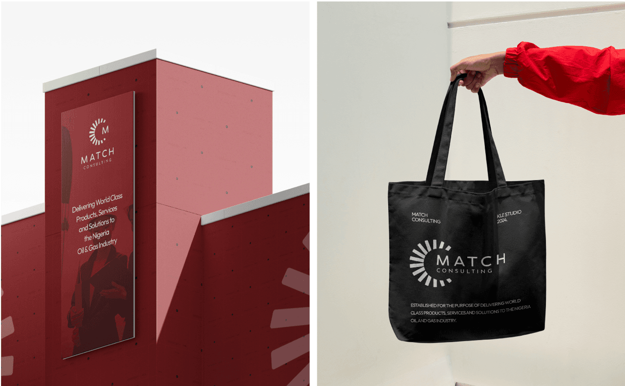
Match Energy was established to deliver world-class products, services and solutions to oil and gas companies. They excel in procuring advantageous commercial and technical partnerships globally.
/Location
United Kingdom
/Services
Brand Identity
/Year
2024
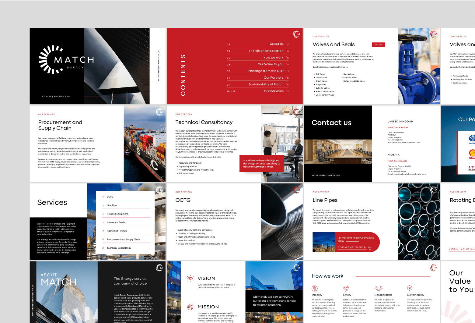
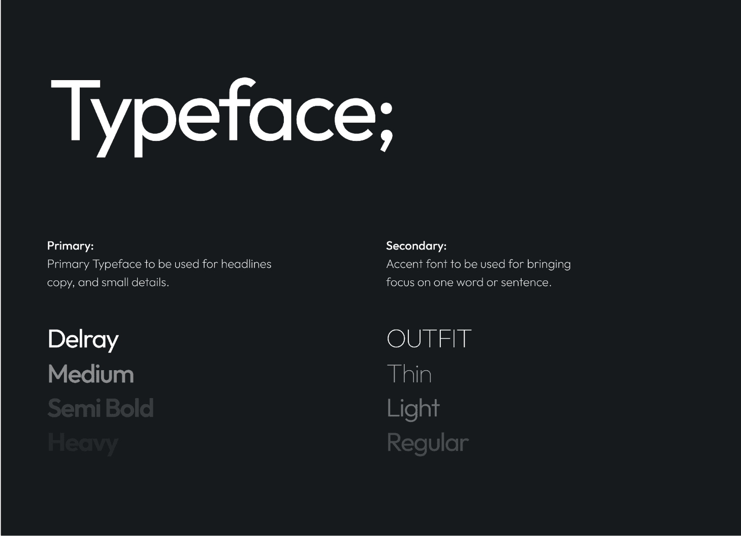
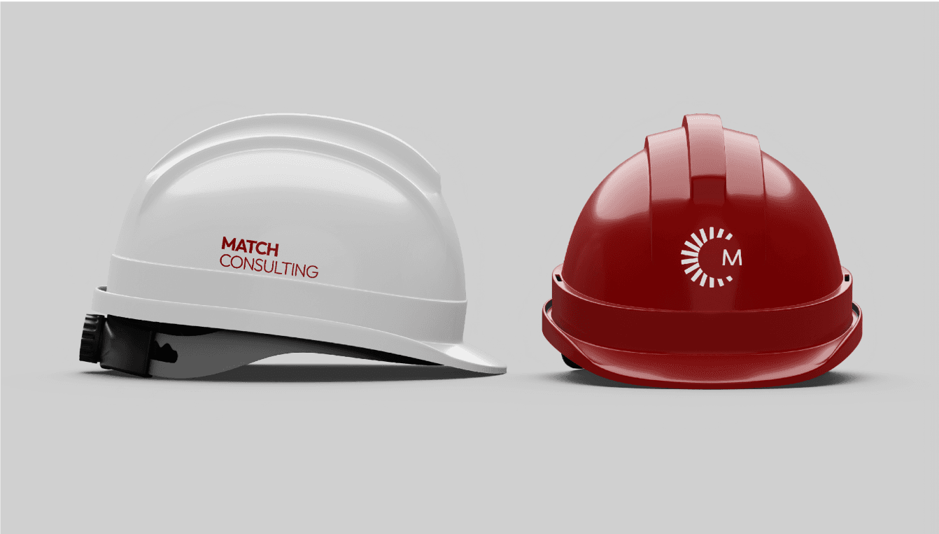
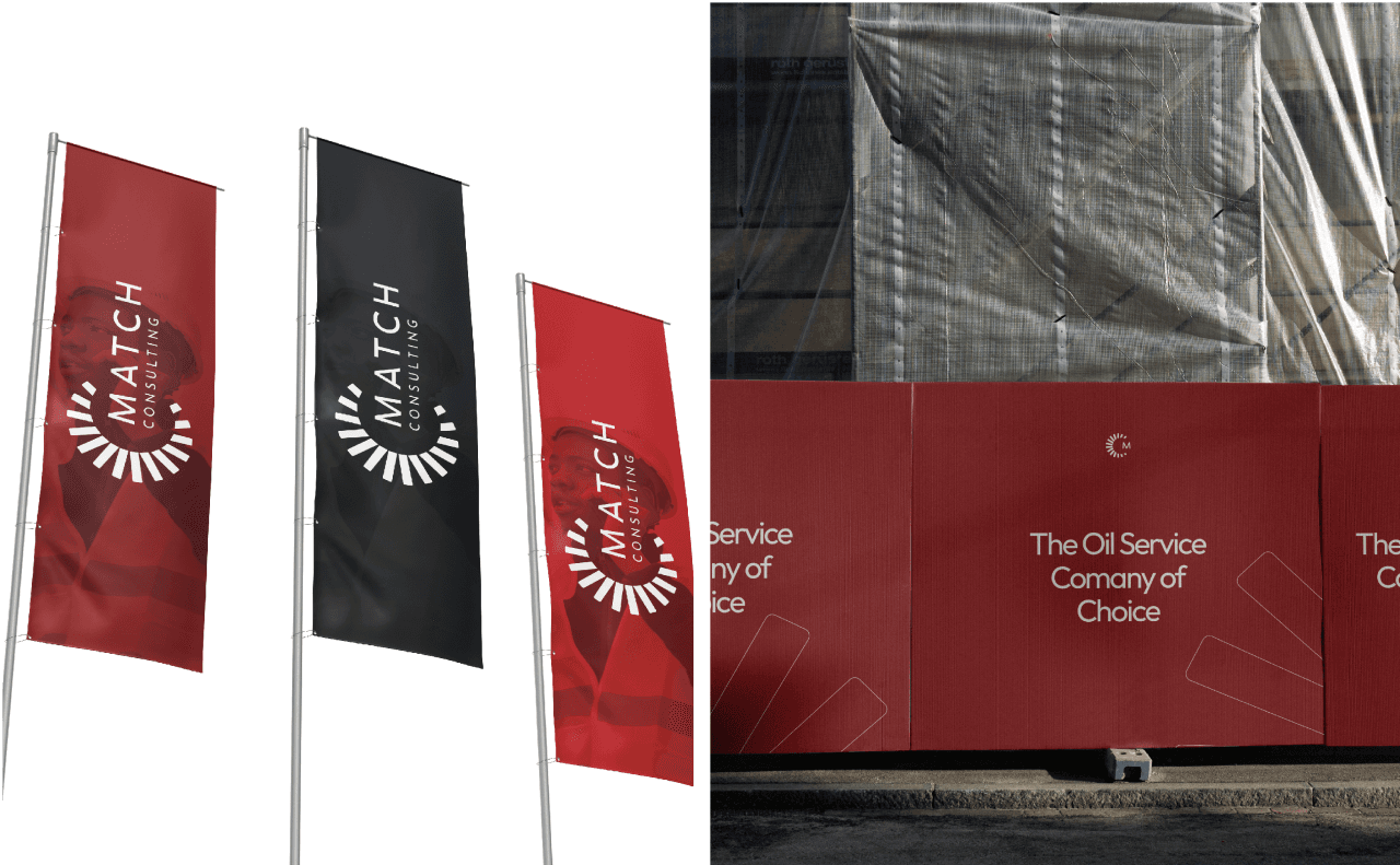
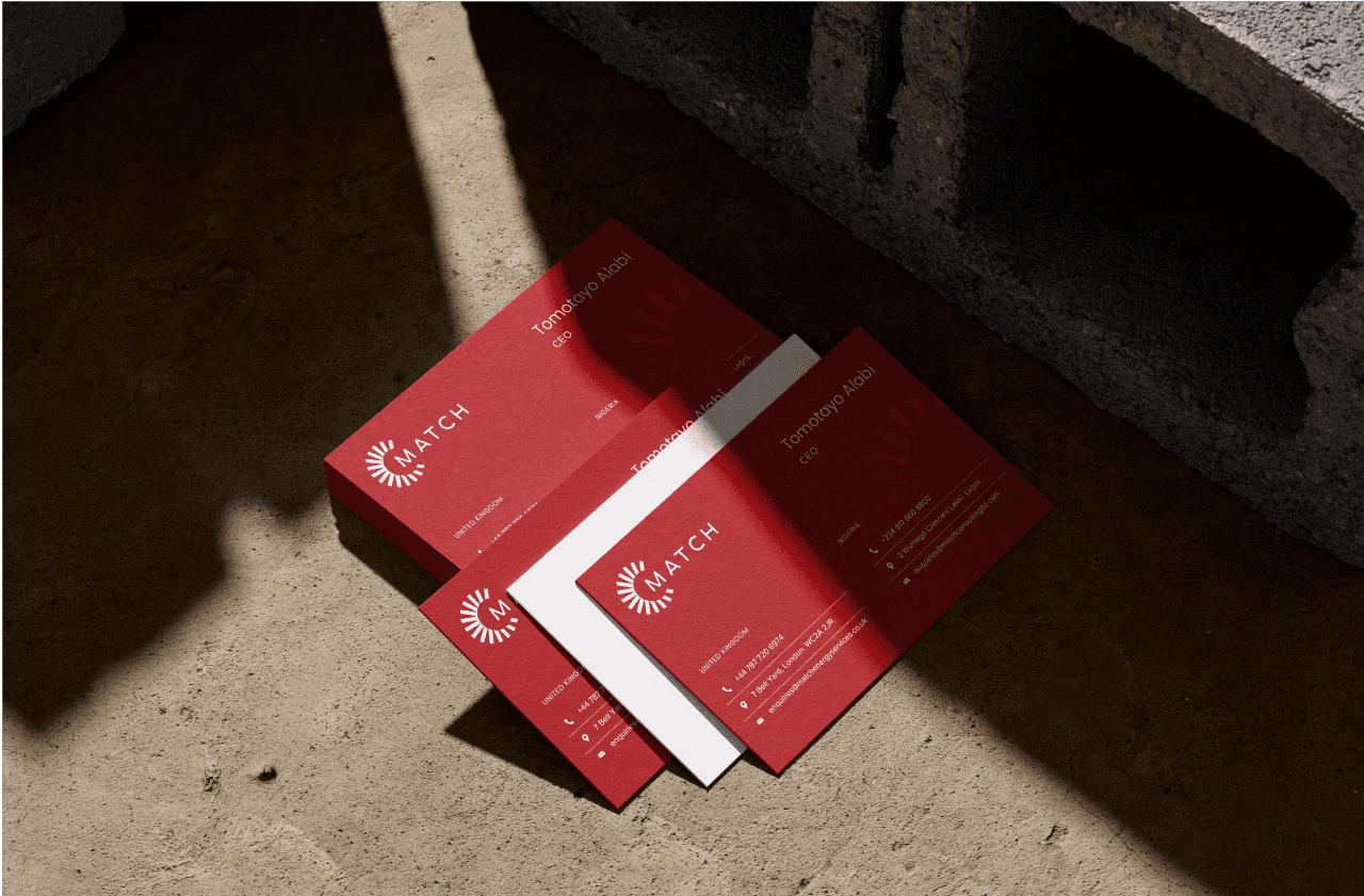
Match Energy’s brand identity is built on professionalism, global reach, innovation, and client value. The design elements and messaging work together to create a compelling and trustworthy presence in the oil and gas industry, reinforcing the company’s position as a leader in delivering world-class solution.
Match Energy's goal is to translate these strategic collaborations into tangible benefits for our clients, offering them superior, cost-effective solutions that set new standards in excellence and value
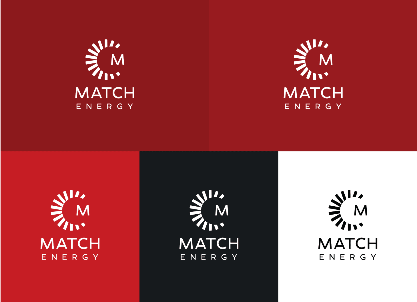
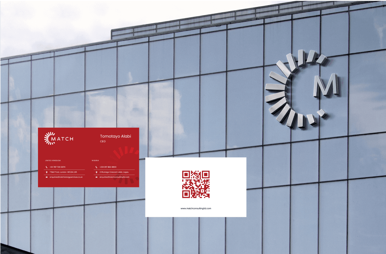
For the primary mark (icon), this is a grid/geometric system that simply shows how the tremendous icon was formed. Through radial interlocking circles and subtraction of some body, this mark came to life.
Derived from the brands original, icon is the geometric pattern that can be used on every touch point in the visual, just as a way of communication the visual identity.
The synergy of operations in the UK and Nigeria uniquely positions Match to solve complex problems for it's customers.
/Credits
Daniel Grayson (Brand Designer)
