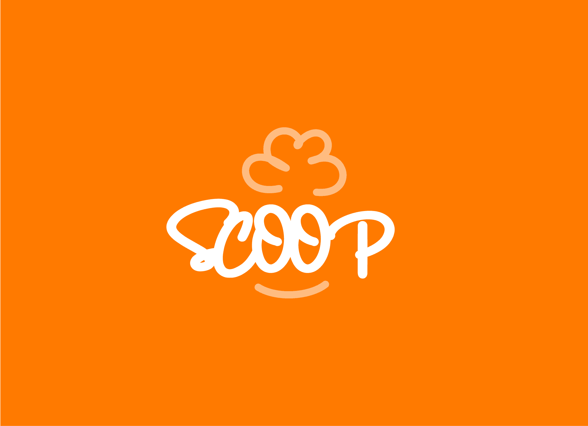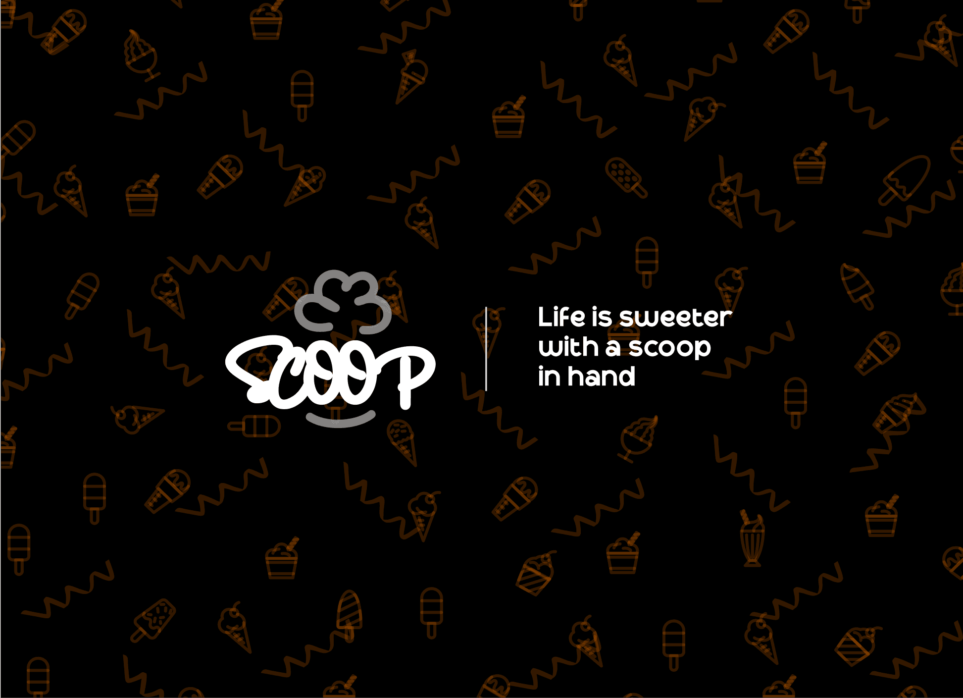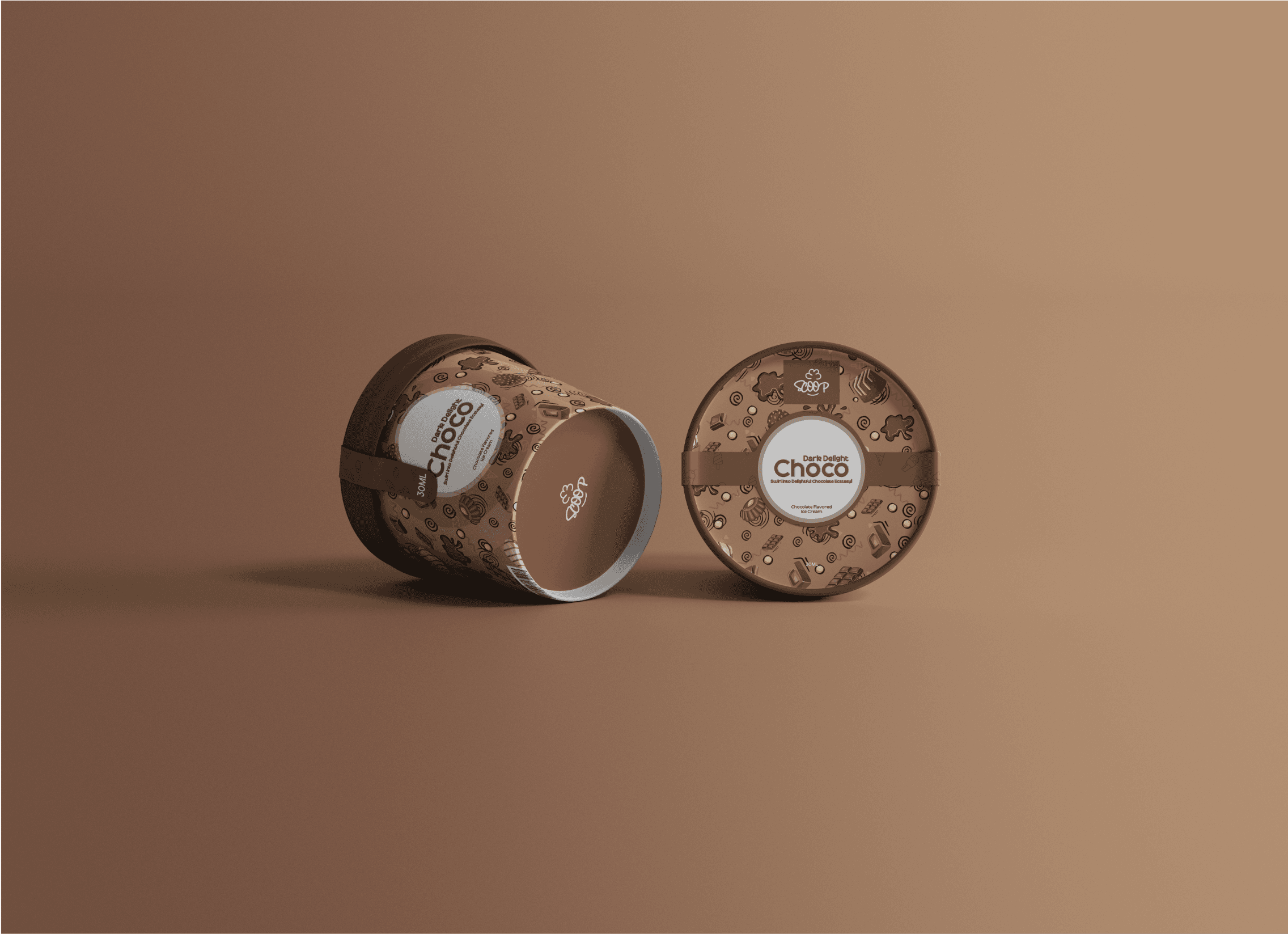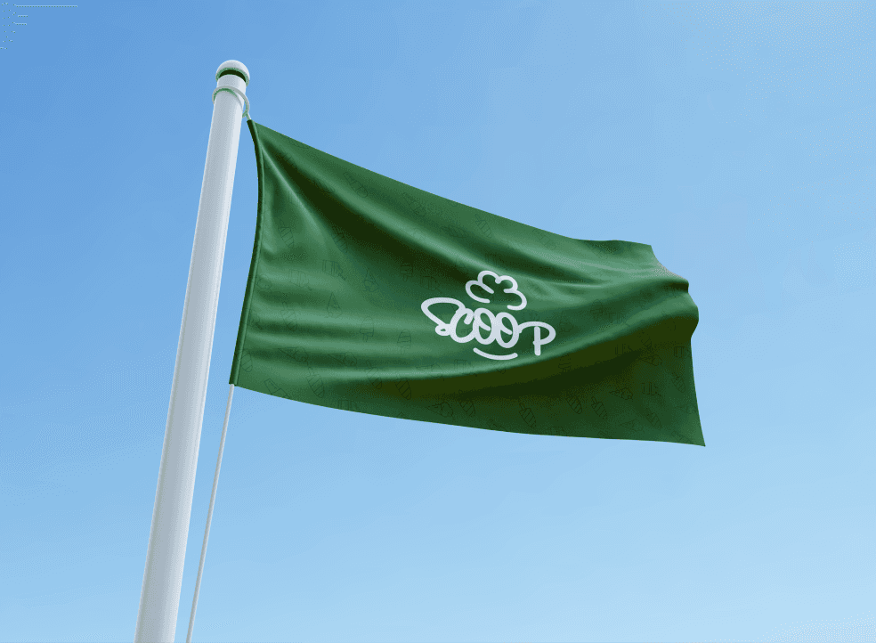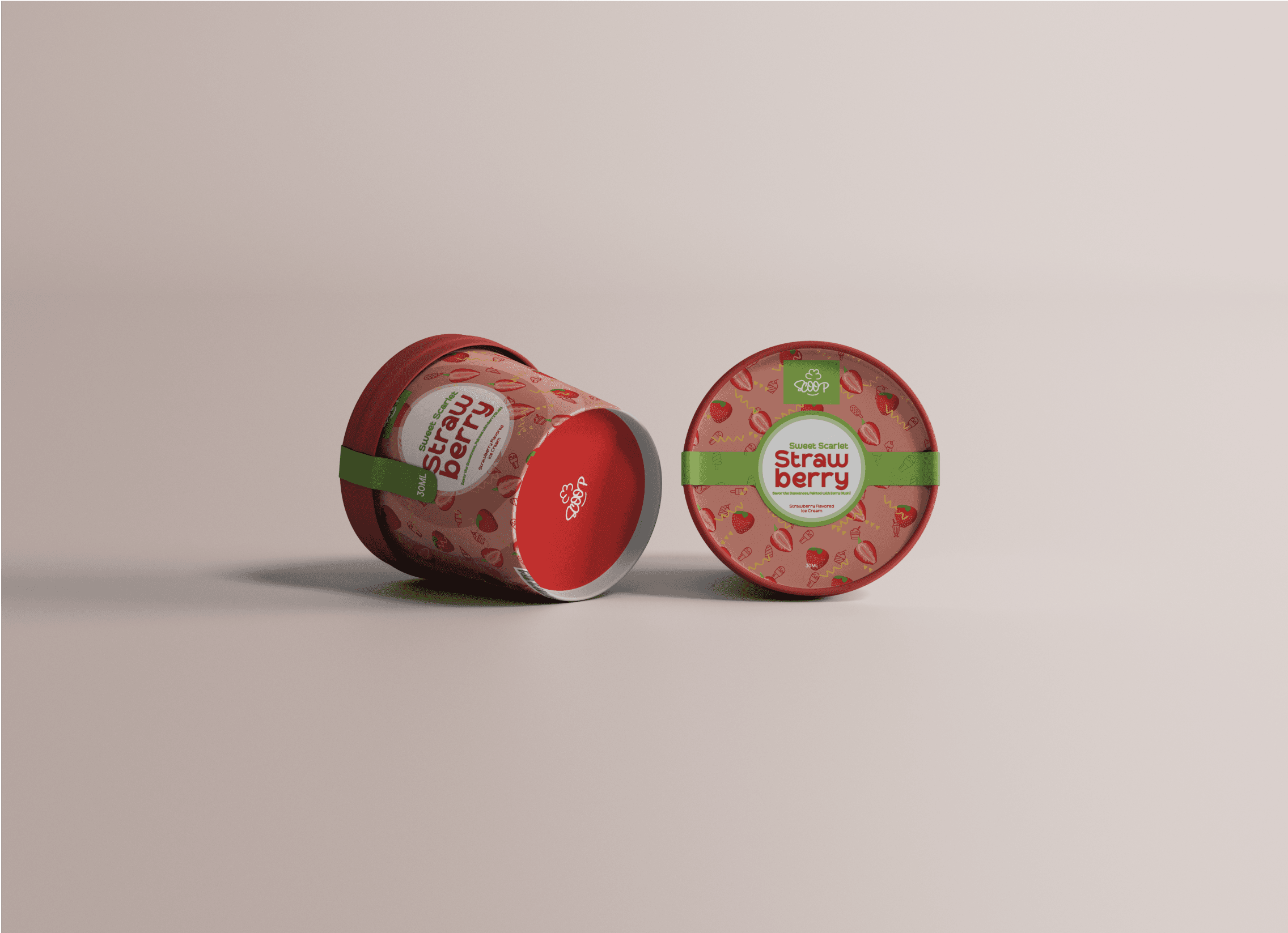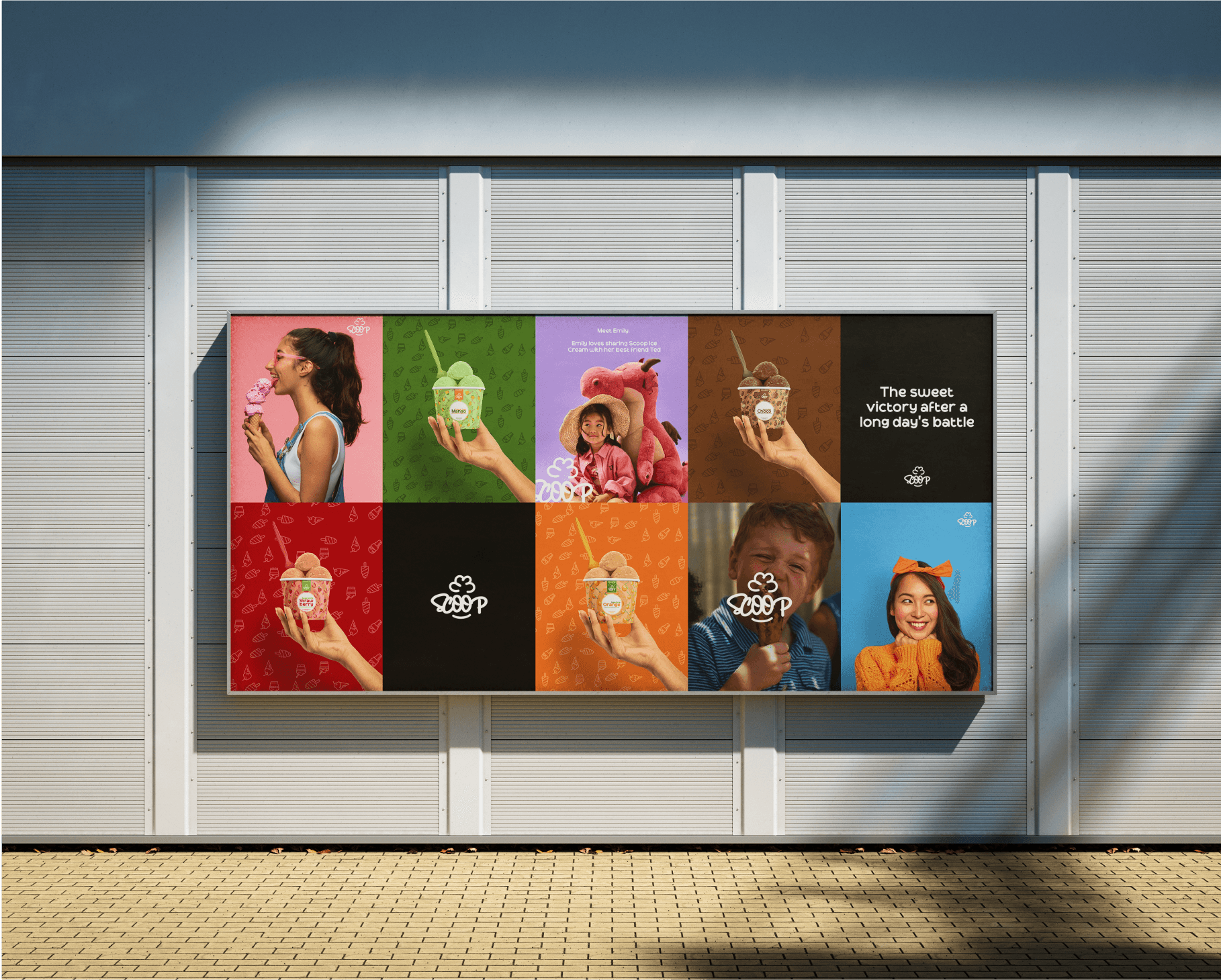
Scoop is an ice cream brand focused on bringing the inner child in you through delectable creamy ice cream. For the logo, I designed a familiar happy face, the name spelled as SCOOP and also signifying a set eyes, the top an ice cream frosting but also shows the hair of a child, the bottom signifying the smile of a child enjoying scoop ice cream. It also shows the rear-end of an ice cream cone.
/Location
Canada
/Services
Packaging & Advertising
/Year
2024
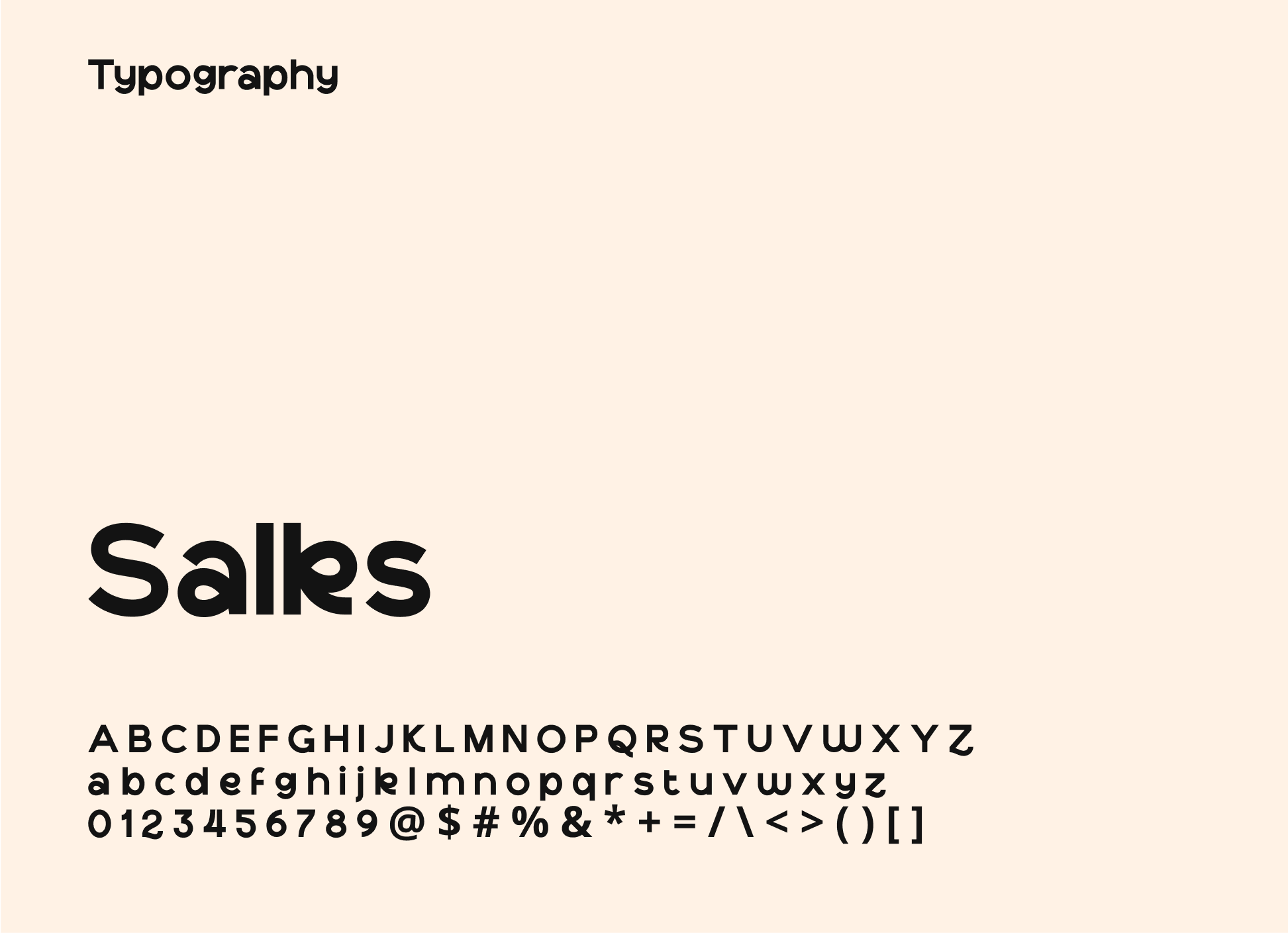
Choosing a font like 'Salks' for Scoop ice cream can be deliberate due to its playful, handwritten style that reflects the enjoyable nature of ice cream.
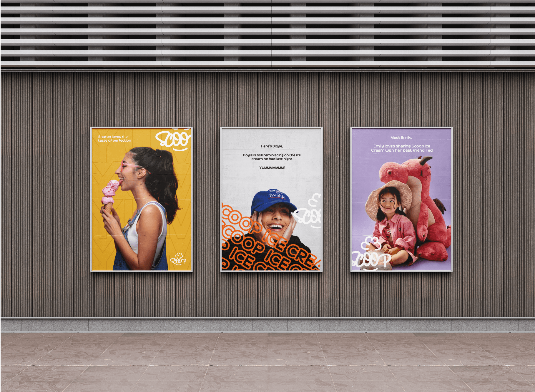
Whether it's a sunny afternoon treat or a midnight craving, let Scoop Ice Cream be your go-to companion for moments that deserve a touch of sweetness
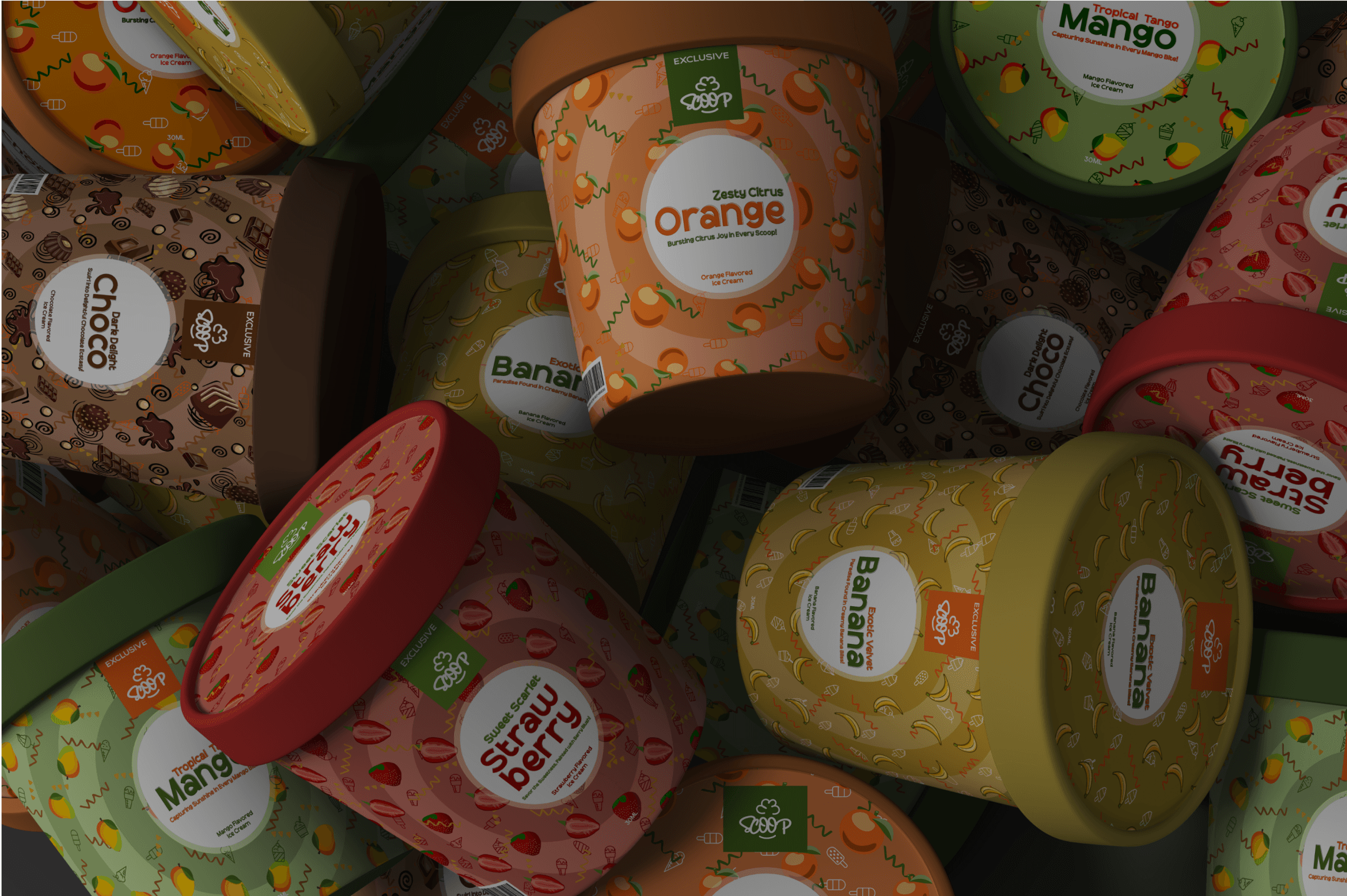
The client needed a packaging redesign design for the product, I designed a packaging that is both colorful and familiar as the brand not only focuses on children but a happy families.
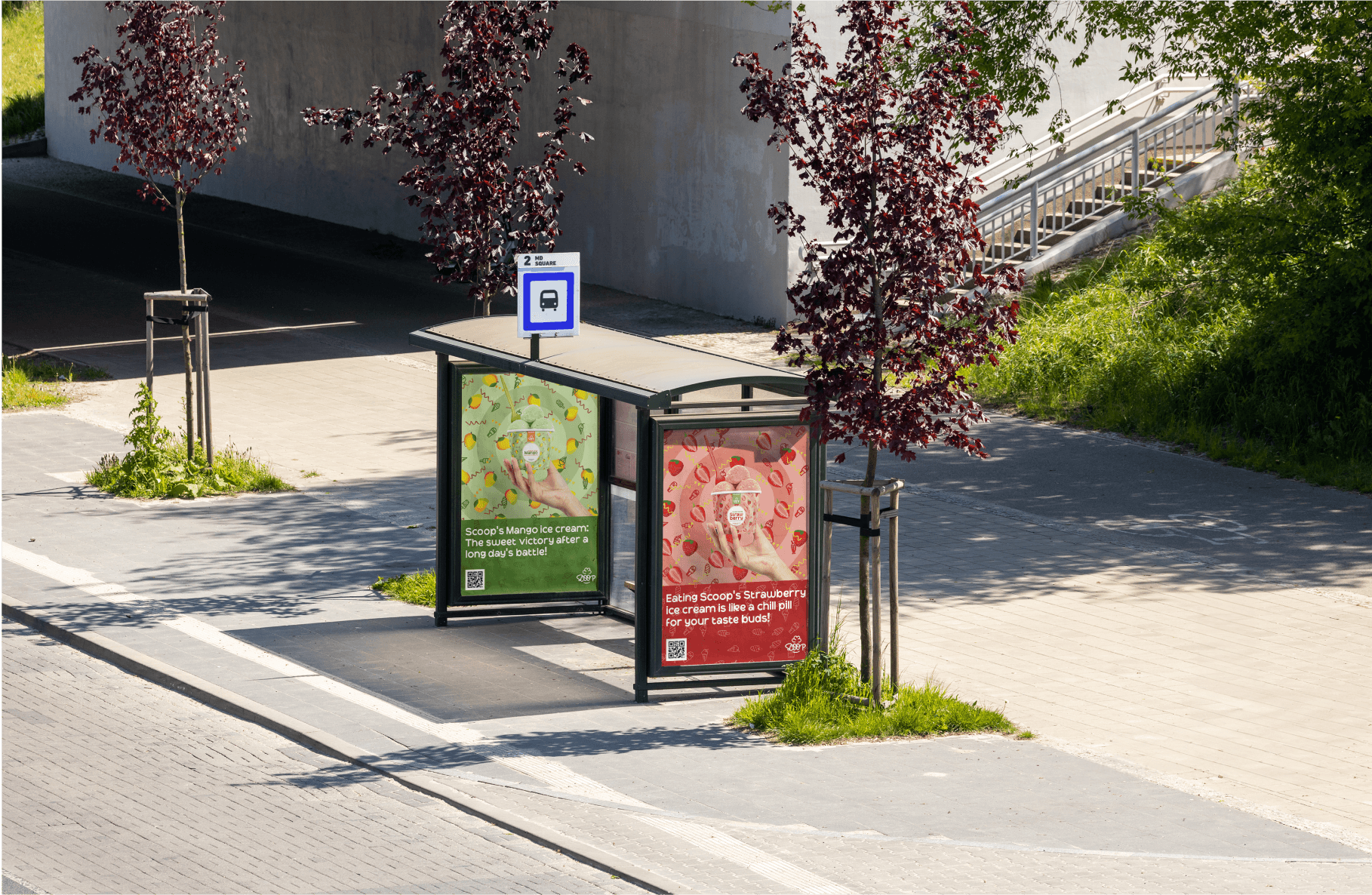
Scoop is a sunset lap for your taste buds, grab a cup. It wont bite :)
Scoop's ice cream is like a high-five from your taste buds!
/Credits
Daniel Grayson (Brand Designer)
